Functional control charts for multivariate quality characteristics
In this vignette we show how to use the funcharts
package to apply the methods proposed in Colosimo and Pacella et
al. (2010) to build control charts for monitoring a multivariate
functional quality characteristic. Let us show how the
funcharts package works through an example with the dataset
air.
First of all, starting from the discrete data, let us build the
multivariate functional data objects of class mfd, see
vignette("mfd").
library(funcharts)
data("air")
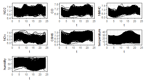
mfdobj <- get_mfd_list(air, grid = 1:24)
nobs <- dim(mfdobj$coefs)[2]
nobs
#> [1] 355
plot_mfd(mfdobj)
In order to perform the statistical process monitoring analysis, we divide the data set into a phase I and a phase II dataset.
rows1 <- 1:300
rows2 <- 301:355
mfdobj1 <- mfdobj[rows1]
mfdobj2 <- mfdobj[rows2]
Multivariate functional principal component analysis
For class mfd we provide a function
pca_mfd, which is a wrapper to pca.fd. It
returns multivariate functional principal component scores summed over
variables (fda::pca.fd returns an array of scores when
providing a multivariate functional data object). Moreover, the
eigenfunctions or multivariate functional principal components given in
harmonics argument are converted to the mfd
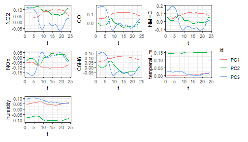
class. We also provide a plot function for the eigenfunctions (the
argument harm selects which components to plot).
pca <- pca_mfd(mfdobj1)
plot_pca_mfd(pca, harm = 1:3)
Control charts
The function control_charts_pca provides a data frame
with all the information required to plot the desired control charts on
multivariate functional data, based on the Hotelling’s \(T^2\) and the squared prediction error
statistics (see Colosimo and Pacella (2010), Capezza et al. (2020)).
Among the arguments, you can pass a tuning_data set, that
is not used for model estimation/training, but only to estimate control
chart limits. If this data set is not provided, control chart limits are
calculated on the basis of the training data. The argument
newdata contains the phase II data set of observations of
multivariate functional covariates to be monitored. The function
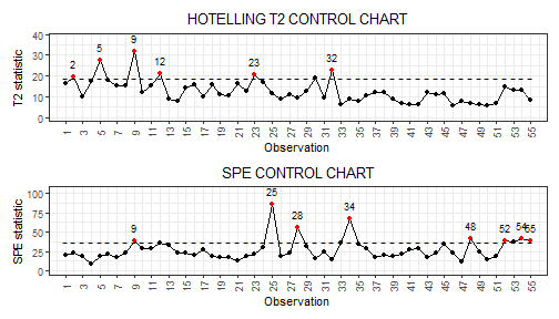
plot_control_charts returns the plot of the control
charts.
cclist_pca <- control_charts_pca(pca = pca, newdata = mfdobj2)
plot_control_charts(cclist_pca)
Fault detection
Once an out-of-control observation is identified in a control chart, one can obtain the contribution of the functional covariates to the monitoring statistics to understand which variable was possibly responsible of the anomalous observation.
We can get the out of control observations using
which_ooc.
ooc_index <- which_ooc(cclist_pca)
ooc_index
#> $T2
#>    n  id
#> 1  2 302
#> 2  5 305
#> 3  9 309
#> 4 12 312
#> 5 23 323
#> 6 32 332
#>
#> $spe
#>    n  id
#> 1  9 309
#> 2 25 325
#> 3 28 328
#> 4 34 334
#> 5 48 348
#> 6 52 352
#> 7 54 354
#> 8 55 355
From the control charts it is possible to see some phase II
observations out of control. For example, let us consider observation 9.
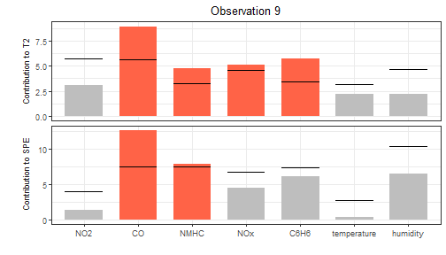
We can exploit the contribution plots using the function
cont_plot to identify the variables responsible of the
anomaly. The contributions are plotted as bar plots, against upper
control limits estimated empirically on the training data.
cont_plot(cclist_pca, 9) Finally, we can also plot any multivariate functional observation
against a reference data set by using the function
plot_mon:
plot_mon(cclist_pca, fd_train = mfdobj1, fd_test = mfdobj2[9]) This helps to understand which profiles were anomalous. Variables
exceeding contribution plot limits are coloured in red.
References
- Colosimo, BM Pacella, M. (2010) A comparison study of control charts for statistical monitoring of functional data. International Journal of Production Research, 48(6), 1575-1601. https://doi.org/10.1080/00207540802662888
- Capezza C, Lepore A, Menafoglio A, Palumbo B, Vantini S. (2020) Control charts for monitoring ship operating conditions and CO2 emissions based on scalar-on-function regression. Applied Stochastic Models in Business and Industry, 36(3):477–500. https://doi.org/10.1002/asmb.2507